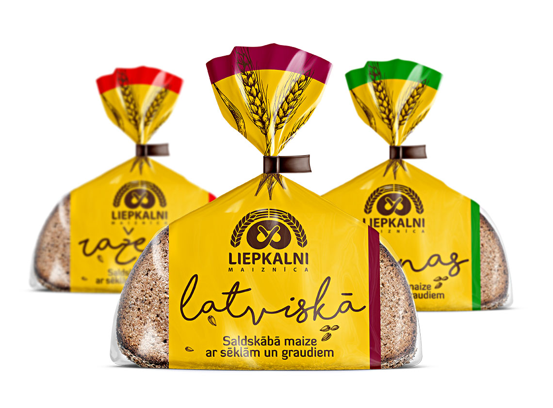
Task
To create a new concept of packaging design for the products of the bakery LIEPKALNI. It is required to create a different packaging design, yet retaining the most important elements. The company is a modern manufacturer of bread, which holds to its deeply ingrained traditions and cares about the top quality. The packaging should be easily recognizable at the point-of-sale and adjustable for all products of LIEPKALNI, so that it generates unified visual expression of the company.
Solution
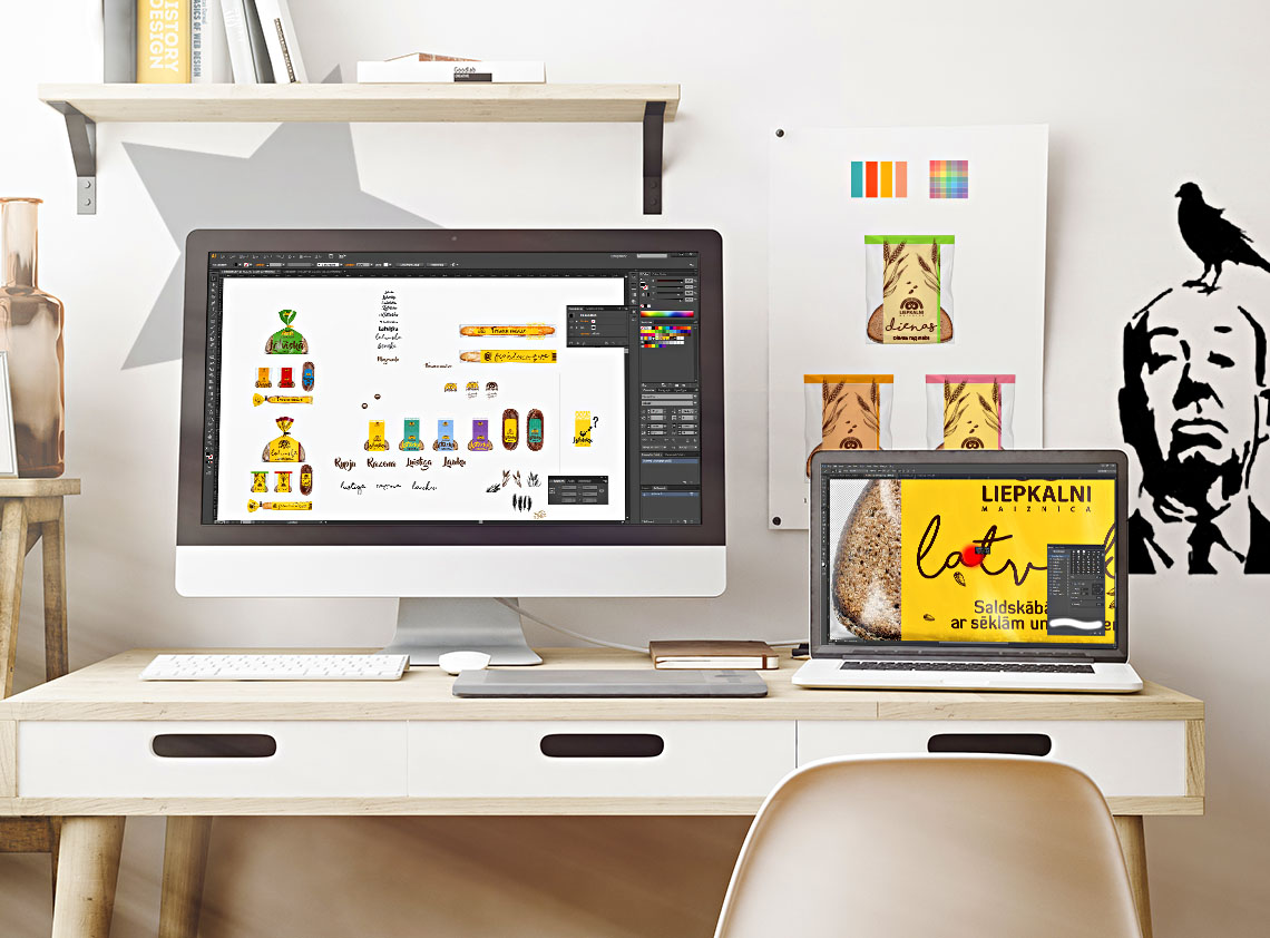
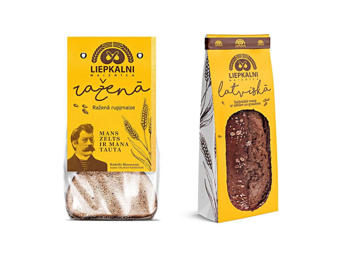
We created packaging design by combining diverse contemporary graphic design techniques and retaining the core brand values – the logo and original colour scheme. The emphasis was placed on covering a large area with the primary colour. This widely recognized yellow colour representing LIEPKALNI products on the supermarket shelves would help customers find products and encourage them to choose their favourite bread brand – LIEPKALNI.
The yellow tone used by the bakery LIEPKALNI is associated with warm and pleasant feelings; what’s more, it is one the best recognized elements among the loyal customers. We decided to keep it and use it over a large area so that it becomes an element of recognition for all products.
We combined the coloured area with calligraphic elements such as rye ears on the upper part of the packaging to create associations of a bundle of grain stalks that symbolizes the origin of bread and represents the basic element of quality. We left both sides of the packaging transparent so that the customer can see the product inside. The same yellow tone is used for packaging of the entire range of LIEPKALNI breads. The only details that have changed are the name of the product and colour code on the top and front part of the packaging so that customers can easily recognize their favourite products.